Tuesday, December 13, 2011
Thursday, November 17, 2011
Concept Art
Here is a preliminary idea of what my commercial will look like.


The most difficult part of my project will be (1) skewing the image of the magic carpet in order to make it look 3D and (2) changing the tones of the colors to match the background. For instance, in this photograph, I will add some orange tinge to the image of the carpet in order to make it seem like it is really in the light of the sunset.
Tuesday, November 15, 2011
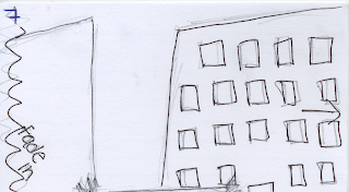
Commercial Storyboard
For my commercial, I wanted to have the maximum effect of making my product appealing, while minimizing the amount of difficult animation I would need to do. This is why I chose to use four large scenic pictures for the entire commercial. Using large photos, I can zoom in and pan across the images to make it look like live-action filming of a scene. Furthermore, by showing the audience photographs of distant, exotic places, the commercial appeals to their sense of adventure. I want to portray the product as a great alternative form of transportation. The sight of the magic carpet going through the air and the idea of traveling to new places should be tempting to individuals of all ages.
For the commercial, I plan on using the following images:


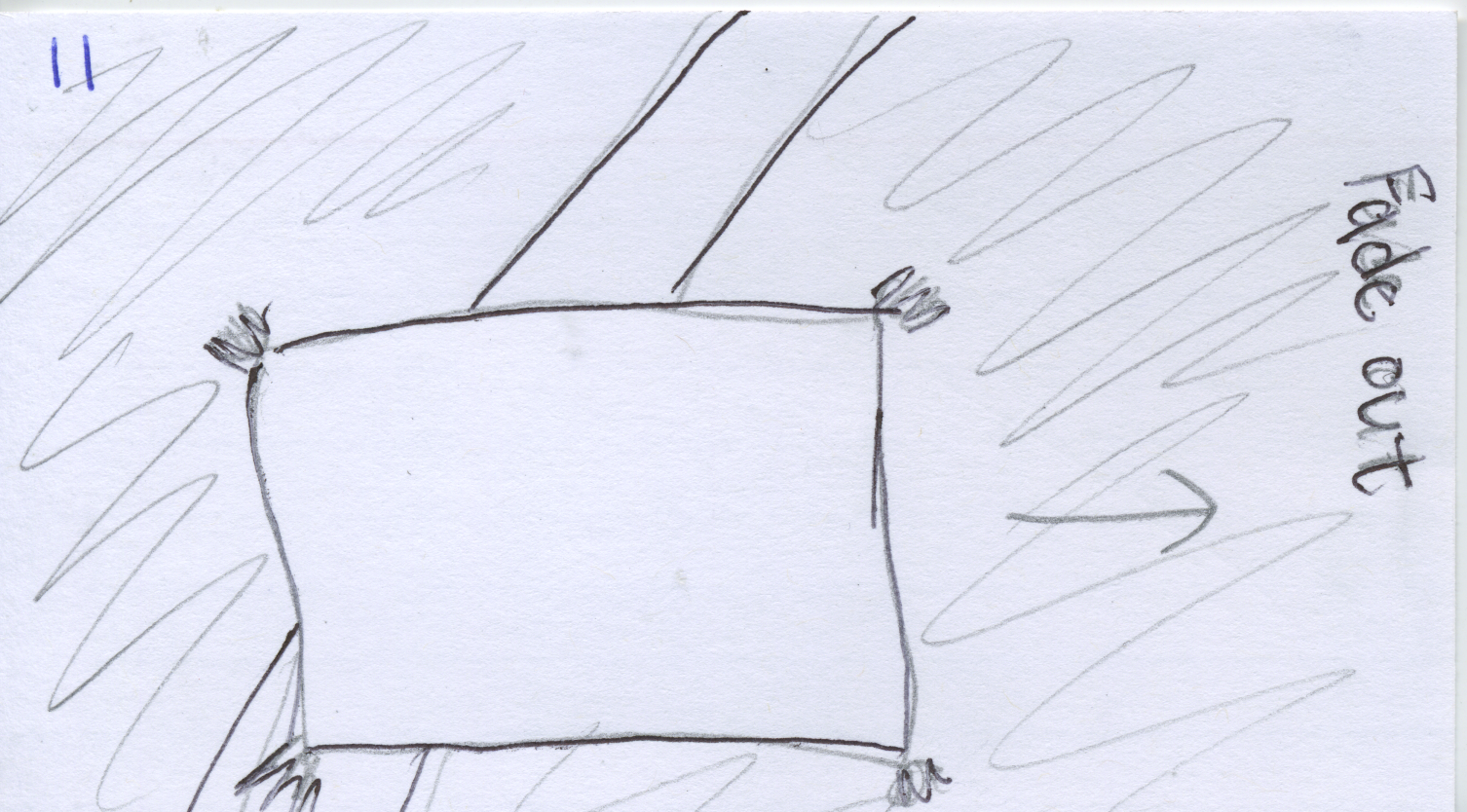
Here is my storyboard that I created using index cards. It simply shows the panning of the multiple scenic shots. It begins with the name of my company, "Magic" over a cloudy, scenic background. The word "Magic" dissolves into dust and the cloudy layer disappears to show the clear sunset. Each photograph fades in and out and the magic carpet is slowly introduced and eventually begins soaring across the screen. In the end, the magic carpet lands on a hill in one of the scenes and the words "Where will you go next?" enter. The commercial will likely end in a freeze frame of this image.


For the commercial, I plan on using the following images:


Here is my storyboard that I created using index cards. It simply shows the panning of the multiple scenic shots. It begins with the name of my company, "Magic" over a cloudy, scenic background. The word "Magic" dissolves into dust and the cloudy layer disappears to show the clear sunset. Each photograph fades in and out and the magic carpet is slowly introduced and eventually begins soaring across the screen. In the end, the magic carpet lands on a hill in one of the scenes and the words "Where will you go next?" enter. The commercial will likely end in a freeze frame of this image.


Tuesday, November 8, 2011
5 Commercial Ideas
#1) Turtle on a boat (seasick), on a plane (bored), train (bumpy ride); happy on the magic carpet. I thought I could show an animal that is usually cowardly, like a turtle, feeling comfortable on the carpet in order to persuade viewers to not be afraid of my product.
#2) A cartoon bird trying to fly a few times but failing. Instead, the little bird climbs on the magic carpet and soars through the sky pas the sun, clouds, and into the nighttime. The words "even the birds prefer it" are displayed on the screen after the bird has landed safely back at his/her tree.
#3) bird's eye view of a famous city, like Paris, the "camera" zooms out and it's clear that the perspective is from a magic carpet hovering above the city. I thought this idea would go well with my slogan "A Whole New World" because it shows the world from a different vantage point than most people get to see everyday.
#4) Panning of a bookshelf with many different picture frames containing different, scenic places. The shot would pan further to the side and the viewer could see the carpet laying on the floor with the text: "Where will you go next?"
#5) Roughly the same concept of #4 but using postcards rather than picture frames. I think both #4 and #5 appeal to the customer's sense of adventure and desire to travel around the world.
Sunday, November 6, 2011
5 Commercial Evaluations
http://www.youtube.com/watch?v=BIFcf922wrk
This is a link to a National Car Rental commercial. The creators used a somewhat humorous voice-over that stresses how professional and smart "you" (the buyer) are. This company addresses business people as their audience; their cars can get an executive where they need to go (particularly during business trips). Their product, according to them, is better than other car rentals because it is convenient and easy to upgrade to a nicer car for a low cost. In terms of how successful this commercial is, I think that it probably leaves business people more apt to look for a National Car Rental company in the area of their next business trip, but it is not appealing to the general public.
http://www.youtube.com/watch?v=fT7dqB3nBPo&feature=related
I like the Budget car commercial because it gives me more of an idea of what I might want to do with my commercial for my Magic Carpet. This commercial appeals to all adults and could easily be aimed at families. It's all about convenient, low-cost travel to anywhere you want to go. There is a spokesperson who is somewhat of a familiar celebrity face, but more than that she is just playing a normal, rational woman who appreciates the logic behind renting a Budget car. As a potential customer, I would certainly look into Budget cars if I was in need of a rental car. In fact, they almost make a non-traveling person desire to go on a trip.
http://www.youtube.com/watch?v=teJe1gCPSTU
This is a very low-budget commercial for a limousine rental company. It shows a lot of pictures of cars and only uses font to convey the message. I will likely just use type in my commercial to convey my message instead of a voice-over as well. I don't think it's a very convincing commercial because it is so boring and doesn't show why their company is better than anyone else's. It's not memorable either. There is no attraction for the audience; it doesn't entice the customers with emotion of excitement or humor.
http://www.youtube.com/watch?v=HwLNgcuNRbw
Going along with my theme of "rental" companies, I looked at this commercial for Blockbuster movie rentals. In this commercial they have a few different scenes and use humor to demonstrate why Red Box takes too long to give customers what they want. They stress the expedience with which they deliver desired products. I'll keep that in mind while making my commercial; the speed with which customers can rent your product greatly affects its convenience and appeal. I think this is an effective commercial because I now know that if I'm looking for an new release film, I should look at Blockbuster rather than Red Box. Blockbuster has clearly undermined their biggest competition. I also like that they didn't use a voice-over but instead had illustrative skits. It seemed like they were not shoving information about the company down viewers' throats.
http://www.youtube.com/watch?v=g4QxZyHdIRk
Here we have a fully animated commercial from 1989 for the Rug Doctor. I chose this one because my commercial will be animated too. I like the fun rug vacuum character. It makes me think that I might personify my rug as a cartoon. Although it is a product aimed at adults of course, the commercial is fun for the whole family to watch. I would like my commercial to be like that too. Instead of an informative, authoritative voice-over or spokesperson, the audience is given the information in a playful way through a cartoon character. I'm not sure if the commercial is very successful because the commercial tries to be young and playful but the product is not a fun one. I think that using a playful mood for my magic carpet would be much more effective than in the rug doctor commercial.
Monday, October 31, 2011
Magic Carpet Brochure


Going along with my non-technical, organic feeling, I used two different fonts (Briem and Phyllis Initials) that are more cursive-like. They are more swirly and light; I thought this went well with the concept of adventure and flying.
Finally, for information content, I gave some preliminary information about my product (the "about us" section), rates, and some testimonials. I thought the customers needed some background on my product (since it is fictional), they needed to know the cost, and I thought that the testimonials could work persuasively.
Tuesday, October 25, 2011
Letterhead

Originally I wanted to place my logo in one of the corners of the page, but the logo did not look cohesive there. Instead, I faded the opacity and placed it in the middle of the page to make it look more like a watermark. I think the image of the sunset lining the top and bottom tie the page together nicely but there is still plenty of blank space for writing the actual letter. Finally, I didn't feel it was important to include my name or the address of the company as any customer could receive that information from the website or by calling the company.
Subscribe to:
Posts (Atom)