Tuesday, December 13, 2011
Thursday, November 17, 2011
Concept Art
Here is a preliminary idea of what my commercial will look like.


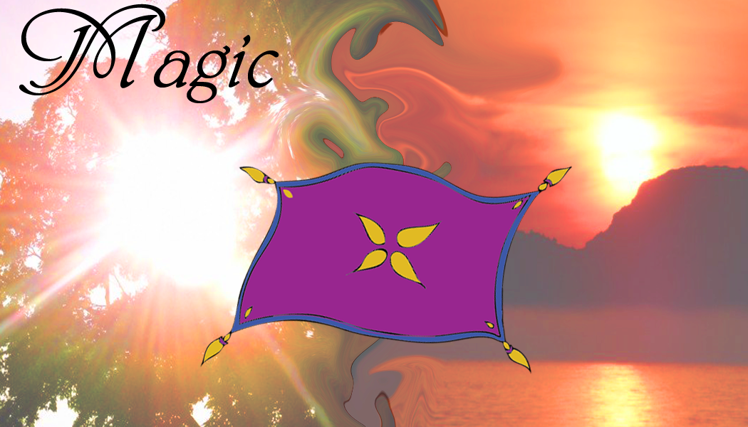
The most difficult part of my project will be (1) skewing the image of the magic carpet in order to make it look 3D and (2) changing the tones of the colors to match the background. For instance, in this photograph, I will add some orange tinge to the image of the carpet in order to make it seem like it is really in the light of the sunset.
Tuesday, November 15, 2011
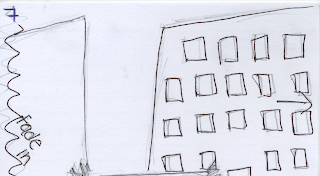
Commercial Storyboard
For my commercial, I wanted to have the maximum effect of making my product appealing, while minimizing the amount of difficult animation I would need to do. This is why I chose to use four large scenic pictures for the entire commercial. Using large photos, I can zoom in and pan across the images to make it look like live-action filming of a scene. Furthermore, by showing the audience photographs of distant, exotic places, the commercial appeals to their sense of adventure. I want to portray the product as a great alternative form of transportation. The sight of the magic carpet going through the air and the idea of traveling to new places should be tempting to individuals of all ages.
For the commercial, I plan on using the following images:


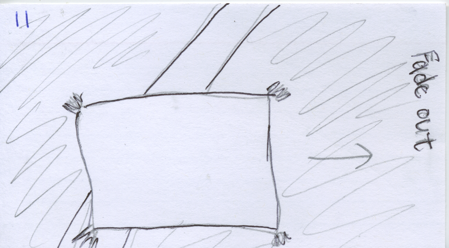
Here is my storyboard that I created using index cards. It simply shows the panning of the multiple scenic shots. It begins with the name of my company, "Magic" over a cloudy, scenic background. The word "Magic" dissolves into dust and the cloudy layer disappears to show the clear sunset. Each photograph fades in and out and the magic carpet is slowly introduced and eventually begins soaring across the screen. In the end, the magic carpet lands on a hill in one of the scenes and the words "Where will you go next?" enter. The commercial will likely end in a freeze frame of this image.


For the commercial, I plan on using the following images:


Here is my storyboard that I created using index cards. It simply shows the panning of the multiple scenic shots. It begins with the name of my company, "Magic" over a cloudy, scenic background. The word "Magic" dissolves into dust and the cloudy layer disappears to show the clear sunset. Each photograph fades in and out and the magic carpet is slowly introduced and eventually begins soaring across the screen. In the end, the magic carpet lands on a hill in one of the scenes and the words "Where will you go next?" enter. The commercial will likely end in a freeze frame of this image.


Tuesday, November 8, 2011
5 Commercial Ideas
#1) Turtle on a boat (seasick), on a plane (bored), train (bumpy ride); happy on the magic carpet. I thought I could show an animal that is usually cowardly, like a turtle, feeling comfortable on the carpet in order to persuade viewers to not be afraid of my product.
#2) A cartoon bird trying to fly a few times but failing. Instead, the little bird climbs on the magic carpet and soars through the sky pas the sun, clouds, and into the nighttime. The words "even the birds prefer it" are displayed on the screen after the bird has landed safely back at his/her tree.
#3) bird's eye view of a famous city, like Paris, the "camera" zooms out and it's clear that the perspective is from a magic carpet hovering above the city. I thought this idea would go well with my slogan "A Whole New World" because it shows the world from a different vantage point than most people get to see everyday.
#4) Panning of a bookshelf with many different picture frames containing different, scenic places. The shot would pan further to the side and the viewer could see the carpet laying on the floor with the text: "Where will you go next?"
#5) Roughly the same concept of #4 but using postcards rather than picture frames. I think both #4 and #5 appeal to the customer's sense of adventure and desire to travel around the world.
Sunday, November 6, 2011
5 Commercial Evaluations
http://www.youtube.com/watch?v=BIFcf922wrk
This is a link to a National Car Rental commercial. The creators used a somewhat humorous voice-over that stresses how professional and smart "you" (the buyer) are. This company addresses business people as their audience; their cars can get an executive where they need to go (particularly during business trips). Their product, according to them, is better than other car rentals because it is convenient and easy to upgrade to a nicer car for a low cost. In terms of how successful this commercial is, I think that it probably leaves business people more apt to look for a National Car Rental company in the area of their next business trip, but it is not appealing to the general public.
http://www.youtube.com/watch?v=fT7dqB3nBPo&feature=related
I like the Budget car commercial because it gives me more of an idea of what I might want to do with my commercial for my Magic Carpet. This commercial appeals to all adults and could easily be aimed at families. It's all about convenient, low-cost travel to anywhere you want to go. There is a spokesperson who is somewhat of a familiar celebrity face, but more than that she is just playing a normal, rational woman who appreciates the logic behind renting a Budget car. As a potential customer, I would certainly look into Budget cars if I was in need of a rental car. In fact, they almost make a non-traveling person desire to go on a trip.
http://www.youtube.com/watch?v=teJe1gCPSTU
This is a very low-budget commercial for a limousine rental company. It shows a lot of pictures of cars and only uses font to convey the message. I will likely just use type in my commercial to convey my message instead of a voice-over as well. I don't think it's a very convincing commercial because it is so boring and doesn't show why their company is better than anyone else's. It's not memorable either. There is no attraction for the audience; it doesn't entice the customers with emotion of excitement or humor.
http://www.youtube.com/watch?v=HwLNgcuNRbw
Going along with my theme of "rental" companies, I looked at this commercial for Blockbuster movie rentals. In this commercial they have a few different scenes and use humor to demonstrate why Red Box takes too long to give customers what they want. They stress the expedience with which they deliver desired products. I'll keep that in mind while making my commercial; the speed with which customers can rent your product greatly affects its convenience and appeal. I think this is an effective commercial because I now know that if I'm looking for an new release film, I should look at Blockbuster rather than Red Box. Blockbuster has clearly undermined their biggest competition. I also like that they didn't use a voice-over but instead had illustrative skits. It seemed like they were not shoving information about the company down viewers' throats.
http://www.youtube.com/watch?v=g4QxZyHdIRk
Here we have a fully animated commercial from 1989 for the Rug Doctor. I chose this one because my commercial will be animated too. I like the fun rug vacuum character. It makes me think that I might personify my rug as a cartoon. Although it is a product aimed at adults of course, the commercial is fun for the whole family to watch. I would like my commercial to be like that too. Instead of an informative, authoritative voice-over or spokesperson, the audience is given the information in a playful way through a cartoon character. I'm not sure if the commercial is very successful because the commercial tries to be young and playful but the product is not a fun one. I think that using a playful mood for my magic carpet would be much more effective than in the rug doctor commercial.
Monday, October 31, 2011
Magic Carpet Brochure


Going along with my non-technical, organic feeling, I used two different fonts (Briem and Phyllis Initials) that are more cursive-like. They are more swirly and light; I thought this went well with the concept of adventure and flying.
Finally, for information content, I gave some preliminary information about my product (the "about us" section), rates, and some testimonials. I thought the customers needed some background on my product (since it is fictional), they needed to know the cost, and I thought that the testimonials could work persuasively.
Tuesday, October 25, 2011
Letterhead

Originally I wanted to place my logo in one of the corners of the page, but the logo did not look cohesive there. Instead, I faded the opacity and placed it in the middle of the page to make it look more like a watermark. I think the image of the sunset lining the top and bottom tie the page together nicely but there is still plenty of blank space for writing the actual letter. Finally, I didn't feel it was important to include my name or the address of the company as any customer could receive that information from the website or by calling the company.
Sunday, October 23, 2011
Business Card


Tuesday, October 18, 2011
5 Business Card Sketches
The following images are possible non-information sides for my business cards


The following images are the possibilities for the information side of my business cards:


For all of my business card sketches, I used the same font, different organic shapes, and different images of nature. I want my product to be attractive to people of all ages, particularly families, so I was sure to use bright, beautiful colors. The font I used seemed mystical, or magical and I thought this strongly represented the mysticism I want to be associated with my product. With a magic carpet, costumers can explore "a whole new world" (my slogan) and therefore it should be associated with a certain mysterious feeling. Because the carpets are made to fly through the sky, I wanted to utilize images of the sky to give the buyers an idea of the beauty they can explore. Accordingly, when I didn't use images of the sky, I wanted to use not rigid, but organic shapes like clouds, swirls, and slightly transparent spots. I hope those types of shape would imply the connection to nature that the magic carpet will bring them. My product is not about modernity, or technology, but rather adventure, exploration, and nature. I have eight different sketches because I am willing to use any combination of two sketches to create the front and back of my card.
Wednesday, October 12, 2011
Corporate Identity Questionnaire
Corporate Identity Questionnaire (Due 10/17)
1) What is your business?
My company sells magic carpets.
2) Describe your business in one sentence
We sell magic carpets to people of all ages, allowing them to soar through the air.
3) Who is your target audience?
Children ages 10+, young adults, mothers, fathers, college students, teens.
4) Who are your competitors?
My company creates a fictional product, so there are no real competitors. Perhaps theme parks like Disney World or Busch Gardens could be seen as my competitors because they offer thrilling family fun.
5) What makes them better/worse than your product/service?
Family theme parks are extremely expensive and often require families to travel long distances. On the other hand, a magic carpet can be permanently bought with one payment. With a magic carpet, families can experience the thrills of roller coasters in their own back yard.
6) Do you currently have an identity? N/A
7) (If your answer to #6 is no, skip this question) What do you like about it and what don’t you like about it? N/A
8) How do you want your image to be seen in two years?
I want Magic to be seen as a trust-worthy, family-friendly company. I want our customers to trust the safety of our product. Furthermore, I want our customers to be so pleased with our product that they suggest it to their friends or buy magic carpets as gifts for children and adults alike.
These following questions might seem silly, but their purpose is to help generate ideas.
9) If your company was an animal, what animal would it be and why?
My company would be a Mccaw bird because it is beautiful, exotic, and flies through the air gracefully.
10) If your company/brand was a person, who would it be and why?
If my company was a person it would be David Blaine because he is mysterious and magical while still managing to be a household name. Blaine consistently surprises and captivates his audience. I would like my product to be shockingly fun and exciting like a famous magician.
11) If your company/brand was an object, what would it be?
I think it would have to be a magic carpet, since that is the only product my company sells.
12) If your customer was a cartoon character, who would it be?
The genie from Aladdin. The genie opens up Aladdin to the world of magic and flying. He represents the mysteriousness and fun that the magic carpet product is trying to achieve.
Sunday, October 9, 2011
Photoshop Collage

When you look closely you will see many different types of foods and drinks; we are both passionate about trying new things, particularly while traveling. Every object represents a different memory. The lyrics accompanying the plane are from a song called "The First Day of My Life" by Bright Eyes. This is one of the first songs we ever heard together and has now become one of "our" songs. After merging all of the layers of different objects, I lowered the saturation on all of them to make them look more cohesive. I chose a bright orange color for the lyrics because i felt it contrasted nicely against the bright blue of the sky. Finally, I liked the dramatic almost fake look of the blue sky backdrop because it seemed to match the cartoonish nature of the plane.
Sunday, October 2, 2011

Sunday, September 25, 2011
Vector Illustration

To the left is my vector illustration and, to me, it represents the word "solace". This sock monkey was a gift from my boyfriend who lives in Virginia. Because we are in a long distance relationship, I use this stuffed animal to provide comfort when he is far away (which is most of the time). His name is Wenceslas, named after a famous square in Prague, Czech Republic (where I met my boyfriend).
I decided to keep the colors as accurate as possible because the object in the illustration, Wenceslas, is what holds the significance. I thought altering the colors drastically would detract from the identity of the object. The most difficult aspects of the illustration are: the red fringe on the hat; the blanket; the wrinkles of the pillow. With the tools I have learned on illustrator, I tried to be as detailed as I could be. My one regret was not being able to portray the specific texture of Wenceslas' body. However, I am proud of the shading on his torso and the wrinkles on the striped pillow. I don't think the illustration looks exactly like the picture, but I can surely see the similarities. I took the artistic liberty of dulling down some of the shading of the photograph. I also used slightly different shades of white to denote Wenceslas' hands and hat versus the pillow he is laying on. I found this to be an important distinction in order to give the illustration more of a 3-dimensional feel. All in all, I am proud of my illustration and, I feel that I illustrated as much detail as possible with the skills I have acquired.

Tuesday, September 13, 2011
Logo

photo credit
My final logo illustration is featured above. It is based on one of my eight original sketches. After discussion with the class, I decided that this logo was the best for my product because it clearly communicates my product, a Magic Carpet, without needing to spell out both words.
I chose the colors blue, purple, and gold for three reasons. (1) I thought these colors would remind consumers of the magic carpet featured in Aladdin (where the idea of a magic carpet was first introduced to mainstream America). With the idea of the Disney movie in their minds, I would hope consumers would feel fond of the product as a result of their warm, nostalgic feelings concerning the movie. (2) Although purple can be seen as a feminine color, I tried to balance the purple with blue (a masculine color) and gold (a gender neutral color) so the product will be equally attractive to both males and females. Finally, (3) I thought the rich colors (as opposed to black and white, for example) would be more eye-grabbing to a younger audience, my target consumers. Nevertheless, the dark tones allow for the product to appeal to all ages instead of being distinctly child-like.
I wanted the font for the word "Magic" to be in a swirly, cursive type font. I think this type of font shows more wispy movement, like the movement of a carpet swirling through the air. Finally, simplicity of the logo allows for it to be enlarged or shrunken and still be very recognizable.
Tuesday, September 6, 2011
Assignment #2
Logos:
1. Starbucks

Personally, I love Starbucks. The coffee is delicious and I've known it to be a socially responsible company. The mermaid princess featured on this logo makes buyers think about the sea, which I have always found odd since coffee doesn't really have anything to do with the ocean. However, I think the counter intuitive illustration makes Starbucks standout against the background of other coffee companies who display cups of coffee or coffee beans. The the use of the dark green color is sophisticated and attracts professional adult buyers - exactly the people who need strong coffee and can afford Starbucks prices. Furthermore, the combination of a mermaid princess with darker colors like black and forest green balances the logo's attraction to both sexes. What's more is that the green logo reminds buyers of 'going green' and implies that Starbucks is an environmentally friendly company.
2. Walmart

Walmart's logo uses bright colors but does not look particularly childish, as a result it is attractive to families. The colors they use are relatively gender neutral as well. The words "Save Money. Live Better" are short and to the point which means that buyers can read it even if they are passing the sign quickly. Walmart's main appeal is their cheap prices so I think the words of the logo really convey their message. Finally, the sun-like figure next to the word Walmart makes Walmart look like a sunny company with a bright future (part of its appeal to families).
3. Subway

I like the way the word "Subway" starts and ends with arrows because it reminds the customers that Subway is a place to get your food when you're on the go. However, the color yellow I find to be off-putting. There is nothing yellow that I want near or around my sandwich. It does not scream fresh or healthy but rather dirty or stained. The words "eat fresh" are well placed because they are short and easy to remember. Moreover, the green outline of the word 'Subway' and filling in the words 'eat fresh' helps to connect the buyers mind to the idea of vegetables and freshness. Overall, I think both genders are likely to be attracted to this and it is not childish. However, it could portray a stronger image of freshness and nutritional foods.
4. Virgin

I always found the Virgin logo to be very strange. First of all, the company's name is "Virgin" which is a powerful word. Additionally, the logo almost looks like the word "virgin" is written in blood. I think the company is trying to appeal to younger buyers because their logo is very dramatic looking, not reserved or family-friendly. Personally, I think the use of the bold color and dripping paint-like font probably turns off older buyers to the company. Who is more likely to be using a phone service, older people or teenagers?
Batman
 Batman, although a hero, is a dark figure. Batman's logo shows a certain intensity to the audience because of the stark contrast between the bright yellow and the depth of the black. Knowing that Batman's biggest fans are probably males, the makers of this logo have used an animalistic illustration and a lot of black space to portray the manliness of this superhero. The image is aggressive. Although adults love Batman too, this logo is aimed more at children's imaginations. There is not too much to look at; it is basic, and thus it is not too much for a young child to take in or process.
6. Coca-Cola

It may be overdone, but I wanted to look at the Coca Cola logo because it has bombarded me throughout my life. Why has this company lasted so long? I think the font used for this logo is key. The cursive words give this logo a very classic feeling. It is gives it an aged feeling, like finding an old letter, but it is timeless. The bright red is not striking like the blood-red of Virgin Mobile, but rather it is an upbeat red. It reminds one of an old 50s diner and a simpler time. Red is a color that can be appealing to both males and females, and the brightness of the shade has children looking twice as well.
1. Starbucks
Personally, I love Starbucks. The coffee is delicious and I've known it to be a socially responsible company. The mermaid princess featured on this logo makes buyers think about the sea, which I have always found odd since coffee doesn't really have anything to do with the ocean. However, I think the counter intuitive illustration makes Starbucks standout against the background of other coffee companies who display cups of coffee or coffee beans. The the use of the dark green color is sophisticated and attracts professional adult buyers - exactly the people who need strong coffee and can afford Starbucks prices. Furthermore, the combination of a mermaid princess with darker colors like black and forest green balances the logo's attraction to both sexes. What's more is that the green logo reminds buyers of 'going green' and implies that Starbucks is an environmentally friendly company.
2. Walmart
Walmart's logo uses bright colors but does not look particularly childish, as a result it is attractive to families. The colors they use are relatively gender neutral as well. The words "Save Money. Live Better" are short and to the point which means that buyers can read it even if they are passing the sign quickly. Walmart's main appeal is their cheap prices so I think the words of the logo really convey their message. Finally, the sun-like figure next to the word Walmart makes Walmart look like a sunny company with a bright future (part of its appeal to families).
3. Subway
I like the way the word "Subway" starts and ends with arrows because it reminds the customers that Subway is a place to get your food when you're on the go. However, the color yellow I find to be off-putting. There is nothing yellow that I want near or around my sandwich. It does not scream fresh or healthy but rather dirty or stained. The words "eat fresh" are well placed because they are short and easy to remember. Moreover, the green outline of the word 'Subway' and filling in the words 'eat fresh' helps to connect the buyers mind to the idea of vegetables and freshness. Overall, I think both genders are likely to be attracted to this and it is not childish. However, it could portray a stronger image of freshness and nutritional foods.
4. Virgin

I always found the Virgin logo to be very strange. First of all, the company's name is "Virgin" which is a powerful word. Additionally, the logo almost looks like the word "virgin" is written in blood. I think the company is trying to appeal to younger buyers because their logo is very dramatic looking, not reserved or family-friendly. Personally, I think the use of the bold color and dripping paint-like font probably turns off older buyers to the company. Who is more likely to be using a phone service, older people or teenagers?
Batman

6. Coca-Cola

It may be overdone, but I wanted to look at the Coca Cola logo because it has bombarded me throughout my life. Why has this company lasted so long? I think the font used for this logo is key. The cursive words give this logo a very classic feeling. It is gives it an aged feeling, like finding an old letter, but it is timeless. The bright red is not striking like the blood-red of Virgin Mobile, but rather it is an upbeat red. It reminds one of an old 50s diner and a simpler time. Red is a color that can be appealing to both males and females, and the brightness of the shade has children looking twice as well.
Tuesday, August 30, 2011
Project #1
Here are my 5-10 ideas for fictional products/companies.
1. Mood lighting - lamp that changes to the mood of the setting. (ex. romantic - dim; studying - bright; bedtime- off)
2. Photographic Glasses - put them on and you have a photographic memory
3. Shrink machine
4. Vampire repellent
5. Magic carpet
6. rocket sneakers
7. anti-gravity pill
1. Mood lighting - lamp that changes to the mood of the setting. (ex. romantic - dim; studying - bright; bedtime- off)
2. Photographic Glasses - put them on and you have a photographic memory
3. Shrink machine
4. Vampire repellent
5. Magic carpet
6. rocket sneakers
7. anti-gravity pill
The Beginning
Hello Art210,
My name is Victoria Blyde but everyone calls me Vicky. Currently, I am a senior at the University of Tampa and come May I will graduate with a degree in Sociology. Over the past three summers I have worked at a company called Massachusetts Educational Financing Authority (MEFA) where I was a Human Resources intern. As a part of my job, I created the weekly newsletter, updating the employees on engagements, weddings, parties and so on. The company payed for me to take a one-day class covering the basics of Photoshop during my first summer there. Ever since,I have played around a lot with Photoshop, making pictures for my friends and stuff like that. The fun I've had working with Photoshop lead me to take this class as an elective. With the skills I acquire in this class I hope to continue using Photoshop (and other programs) as an artistic outlet. Also, I think it will be great to add an artistic dimension to my skill set. Below is the link to a google doc that shows a photograph of my friends and I in the Czech Republic. I edited it using Photoshop (very simple stuff).
Photograph
Subscribe to:
Posts (Atom)