Monday, October 31, 2011

Magic Carpet Brochure

In creating my brochure, I used a sunset as the background for one side and a red(ish) gradient for the other side. The sunset image I used is also featured on my business cards and letterhead, so I thought using this image on my brochure would be a nice way to tie the three things together. I used the eyedropper to pick up on a color from the sunset to make the gradient. I thought the gradient felt similar to a sunset, that's why I used it. I liked how it was organic looking and non-technical.

Going along with my non-technical, organic feeling, I used two different fonts (Briem and Phyllis Initials) that are more cursive-like. They are more swirly and light; I thought this went well with the concept of adventure and flying.

Finally, for information content, I gave some preliminary information about my product (the "about us" section), rates, and some testimonials. I thought the customers needed some background on my product (since it is fictional), they needed to know the cost, and I thought that the testimonials could work persuasively. 

Tuesday, October 25, 2011

Letterhead

 Here is my company letterhead. I wanted to include the most important information: the company name, slogan, logo, website, and telephone number while not making it too cluttered.

Originally I wanted to place my logo in one of the corners of the page, but the logo did not look cohesive there. Instead, I faded the opacity and placed it in the middle of the page to make it look more like a watermark. I think the image of the sunset lining the top and bottom tie the page together nicely but there is still plenty of blank space for writing the actual letter. Finally, I didn't feel it was important to include my name or the address of the company as any customer could receive that information from the website or by calling the company. 

Sunday, October 23, 2011

Business Card

 These are the two sides of my final business card design for my product: a Magic Carpet. My company's name is "Magic" which I featured on the front of the card in a relatively large font. I used a mystical/mysterious font for both the name of the company and the slogan: a whole new world. I used this slogan in order to remind the customers of the beloved film "Aladdin."


The background photograph for both sides of the business card is an image of a sunset in Croatia that I took. I used a painting-like filter on the image in order to make it more cohesive with the cartoonish logo and I lowered the opacity in order to make the black font more visible. While I wanted to use the same font for the company information as I did for the company's name ("Magic") I decided I should use a more legible font. I chose to lower the capacity of the logo just slightly to make it blend in more with the background. I also liked the asymmetry of having the carpet on the top left corner. Finally, I didn't find it necessary to include a fax for my company and I tried to balance the amount of information in both corners as to give the card some balance.  

Tuesday, October 18, 2011

5 Business Card Sketches

The following images are possible non-information sides for my business cards


The following images are the possibilities for the information side of my business cards:


For all of my business card sketches, I used the same font, different organic shapes, and different images of nature. I want my product to be attractive to people of all ages, particularly families, so I was sure to use bright, beautiful colors. The font I used seemed mystical, or magical and I thought this strongly represented the mysticism I want to be associated with my product. With a magic carpet, costumers can explore "a whole new world" (my slogan) and therefore it should be associated with a certain mysterious feeling. Because the carpets are made to fly through the sky, I wanted to utilize images of the sky to give the buyers an idea of the beauty they can explore. Accordingly, when I didn't use images of the sky, I wanted to use not rigid, but organic shapes like clouds, swirls, and slightly transparent spots. I hope those types of shape would imply the connection to nature that the magic carpet will bring them. My product is not about modernity, or technology, but rather adventure, exploration, and nature. I have eight different sketches because I am willing to use any combination of two sketches to create the front and back of my card.


Wednesday, October 12, 2011

Corporate Identity Questionnaire


Corporate Identity Questionnaire (Due 10/17)

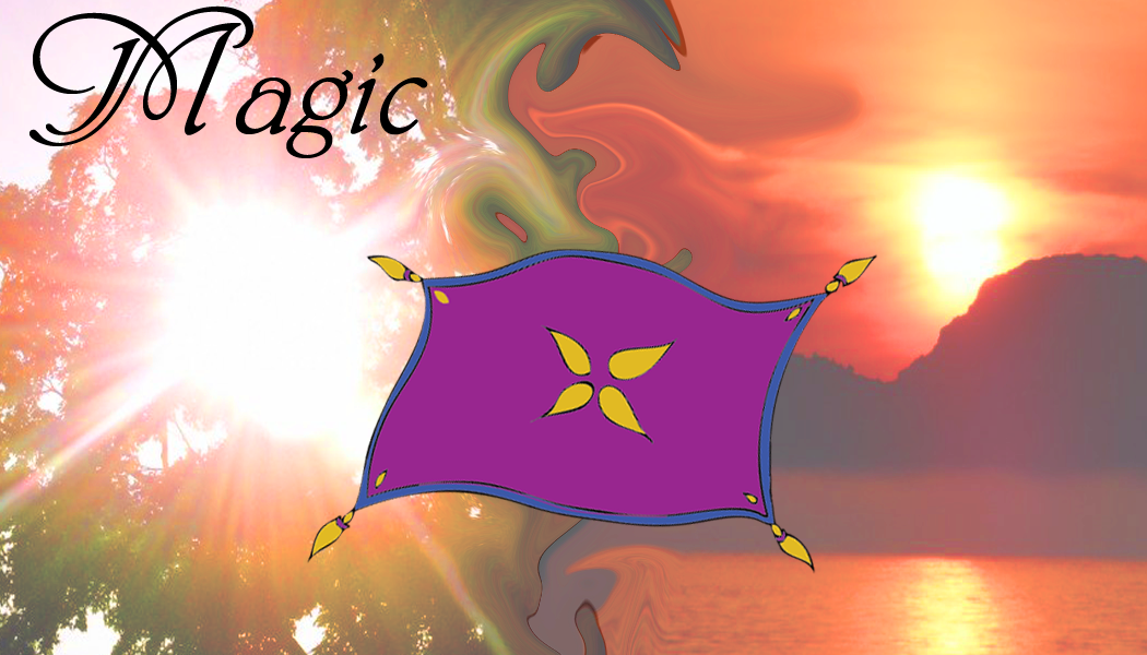
1) What is your business?
My company sells magic carpets.

2) Describe your business in one sentence
We sell magic carpets to people of all ages, allowing them to soar through the air. 

3) Who is your target audience?
Children ages 10+, young adults, mothers, fathers, college students, teens. 


4) Who are your competitors?
My company creates a fictional product, so there are no real competitors. Perhaps theme parks like Disney World or Busch Gardens could be seen as my competitors because they offer thrilling family fun. 


5) What makes them better/worse than your product/service?

Family theme parks are extremely expensive and often require families to travel long distances. On the other hand, a magic carpet can be permanently bought with one payment. With a magic carpet, families can experience the thrills of roller coasters in their own back yard.  

6) Do you currently have an identity? N/A

7) (If your answer to #6 is no, skip this question) What do you like about it and what don’t you like about it? N/A

8) How do you want your image to be seen in two years?
I want Magic to be seen as a trust-worthy, family-friendly company. I want our customers to trust the safety of our product. Furthermore, I want our customers to be so pleased with our product that they suggest it to their friends or buy magic carpets as gifts for children and adults alike. 

These following questions might seem silly, but their purpose is to help generate ideas.

9) If your company was an animal, what animal would it be and why?
My company would be a Mccaw bird because it is beautiful, exotic, and flies through the air gracefully. 


10) If your company/brand was a person, who would it be and why?
If my company was a person it would be David Blaine because he is mysterious and magical while still managing to be a household name. Blaine consistently surprises and captivates his audience. I would like my product to be shockingly fun and exciting like a famous magician. 


11) If your company/brand was an object, what would it be?
I think it would have to be a magic carpet, since that is the only product my company sells. 

12) If your customer was a cartoon character, who would it be?
The genie from Aladdin. The genie opens up Aladdin to the world of magic and flying. He represents the mysteriousness and fun that the magic carpet product is trying to achieve. 

Sunday, October 9, 2011

Photoshop Collage

My photoshop collage is based on my relationship with my boyfriend David. I am in a long-distance relationship, thus the photographs represent our likes, interests, and experiences and they are combined together to form the shape of a plane. We met in Prague, Czech Republic when I was studying abroad. Now, we are always a plane ride away from each other. Accordingly, traveling has always been a motif of our relationship.
When you look closely you will see many different types of foods and drinks; we are both passionate about trying new things, particularly while traveling. Every object represents a different memory. The lyrics accompanying the plane are from a song called "The First Day of My Life" by Bright Eyes. This is one of the first songs we ever heard together and has now become one of "our" songs. After merging all of the layers of different objects, I lowered the saturation on all of them to make them look more cohesive. I chose a bright orange color for the lyrics because i felt it contrasted nicely against the bright blue of the sky. Finally, I liked the dramatic almost fake look of the blue sky backdrop because it seemed to match the cartoonish nature of the plane.